One of the biggest pain points people face when editing website content on a major platform like Wordpress is the sheer complexity or downright obscurity of the user interface.
Even as an experienced developer, I find that navigating the Wordpress dashboard of an established site can sometimes feel akin to defusing a bomb while wearing beer goggles and oven mits.
There may be cases when the idea of using Wordpress for content management is attractive, like when someone on a team is already a Wordpress whizz or is willing to learn its idiosyncracies. But what happens when that person leaves or decides to pass on the torch? How easy is it for someone new to sit down and take over the job of content editor?
Let’s do an experiment
In my experience, simplifying and streamlining user workflows to save content editors time and frustration is THE biggest quality of life improvement that a custom Content Management System (CMS) provides. A well designed CMS helps editors quickly find and update the target content, saving precious time that might’ve otherwise been wasted stumbling around a labrynthian dashboard.
Exactly how much time can a custom CMS save content editors? Enough to merit the time spent building out a custom interface? Enough to spare us the stress-induced hair loss imposed by perplexing UIs?
To get to the bottom of this question, I decided to run an experiment pitting WordPress against a custom CMS I built with Decap.
As you’ll see below, it was hardly a close race.
A novice test subject
Many of my clients are research groups, meaning the folks responsible for website updates are researchers. Thus I recruited a vict-, er, test subject from a lab at the Max Planck Institute.
To best represent what the editing experience would be like for someone entirely naiive to the task of content editing, I recruited Jon, a sharp biochemist with no prior website or content management experience.
Defining the task: updating a CV page
Unless you’re making regular changes to your site, it’s easy to forget the content editing workflow, or user path, within any given CMS. This means it’s important to ensure that CMS user paths are clearly delineated and highly intuitive to avoid reliance on memorization or supplementary guides.
No matter what content you want to add or change, the first step is always to simply navigate to the target content.
With that in mind, the objective I gave Jon was simple: within each CMS, navigate to where you would add an award to this CV/Resume web page. I provided him no other guidance or instruction to start.
I chose this task of updating a CV because:
- Resume updates are a common use case for both personal and professional sites.
- The shortest user path from the dashboard to the target “Add award” screen happens to be the same number of clicks (n=3) for both Wordpress and the custom CMS.
- The data for a CV is usually organized hierarchically into various categories (awards, positions, skills, etc.), which should be reflected in the user path.
By comparing a task with the same path length in both CMSs, we can assume that differences in time to reach the goal are not simply due to differences in how many pages had to load.
Experimental setup
On the monitor presented to the subject were two browser windows: the CV page displayed in one and the CMS start page (post-login) in the other. I read Jon the objective, started the screen recording, and let ‘er rip.
We ran the exercise twice, first using Wordpress as the CMS, then using the custom Decap CMS.
How the trials played out
1. Wordpress trial
As the first couple minutes elapsed, the lack of clarity on where to click first within Wordpress manifested in what I like to call Wandering Mouse Syndrome. Jon explored several off-target tabs like “Media”, “Post”, and “Users”, and each time returned to the dashboard, each time with a slightly deeper brow furrow.
At 2 minutes 30 seconds into the Wordpress run, I gave two hints:
- Look in the top half of the sidebar
- It’s not the “Users” tab
Even with these hints, it took another minute and 17 seconds for Jon to reach the “Add award” target within Wordpress.
2. Custom CMS trial
In contrast, Jon found the “Add award” screen in the custom CMS with no hesitation and no hints in just 8 blazing seconds. Not to mention his eyebrows remained steady and unfurrowed.
The landslide results
The time trial data speak for themselves: the custom CMS wins by a landslide for finding the target content quicker and more efficiently.
| Metric | Wordpress | Custom CMS |
|---|---|---|
| Time to reach goal | 3 min 47 sec | 8 sec |
| Number of clicks to reach goal | 11 | 3 |
| Number of clicks away from goal | 7 | 0 |
A new user was able to navigate to the “Add award” screen in the custom CMS over 28 times faster than in Wordpress.
A few minutes in isolation might not seem meaningful, but consider that this time trial experiment tested one content type and one content update made by one content editor. The potential time savings are exponential when considering a full site with many varied content types that need regular updating and several people functioning as content editors.
One of the biggest differences in this experiment was how many clicks it took for Jon to reach the target content. With Wordpress, he clicked 11 times to reach the target vs just 3 times within the custom CMS.
This difference is despite the fact that the shortest user path to reach the “Add award” target is 3 clicks in both CMS’s.
To better understand the reasons for this discrepancy, consider this table that compares the link names in each user path:
| Click | Name in Wordpress | Name in Custom CMS |
|---|---|---|
| 1 | Resume | Tony’s bio & CV data |
| 2 | Positions | Awards |
| 3 | Add New Position | Add Award |
As suggested by the click table above, the significantly slower and meandering Wordpress trial is likely due to the lack of visibility and clarity of labels within the CMS user interface.
Perhaps most egregiously, the word “award” does not appear even once in the Wordpress user path links whereas it’s visible after the first click in the custom CMS. The word “award” is the visual target a sighted user is searching for and expecting to find in order to complete this task, so the sooner a user locks on to it, the faster they’ll get to editing.
Comparing the UIs screen for screen
To get a better sense of the user experience, let’s compare each screen in the user path.
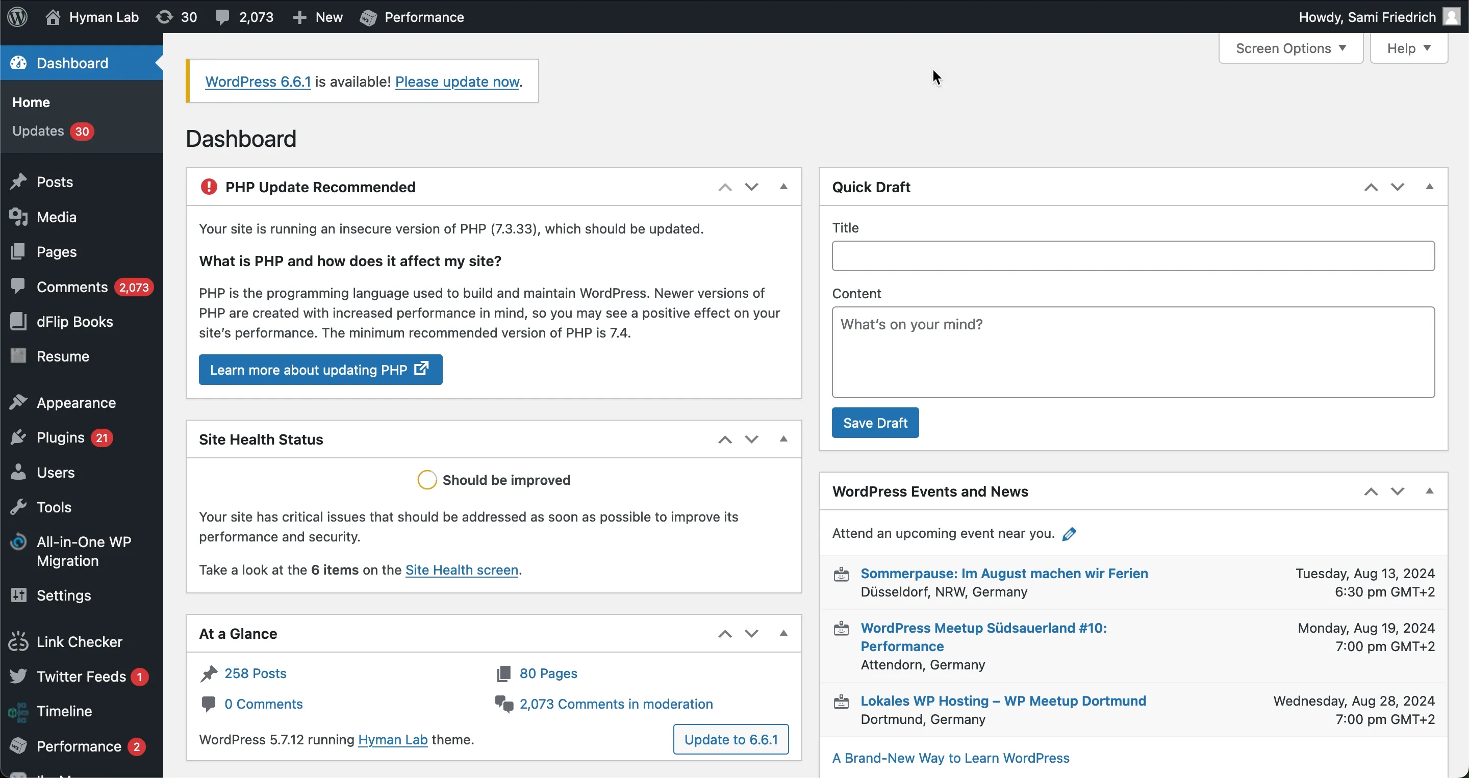
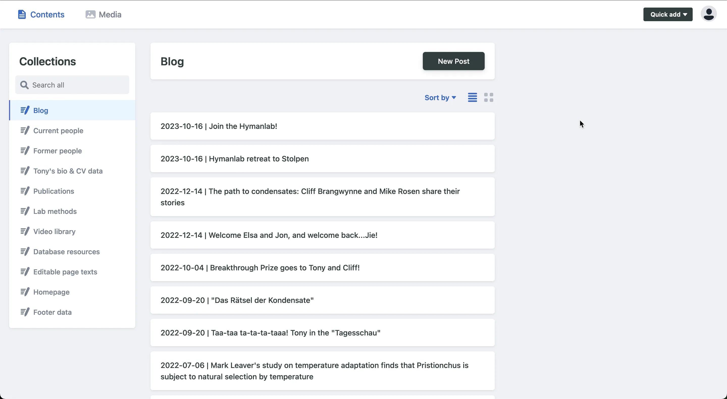
Screen 1: Dashboard upon logging in
Wordpress: The dashboard presents a lot of information to the user, much of which is irrelevant to the task of updating content. Also, the red notification bubbles are distracting.
Custom CMS: The dashboard presents only information that is relevant to user-editable content and provides a helpful search function at the top of the sidebar as an alternative to clicking through via the sidebar.
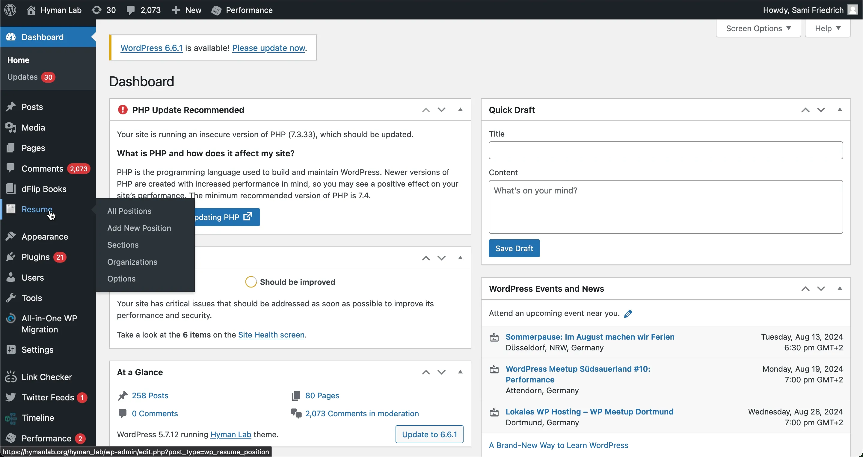
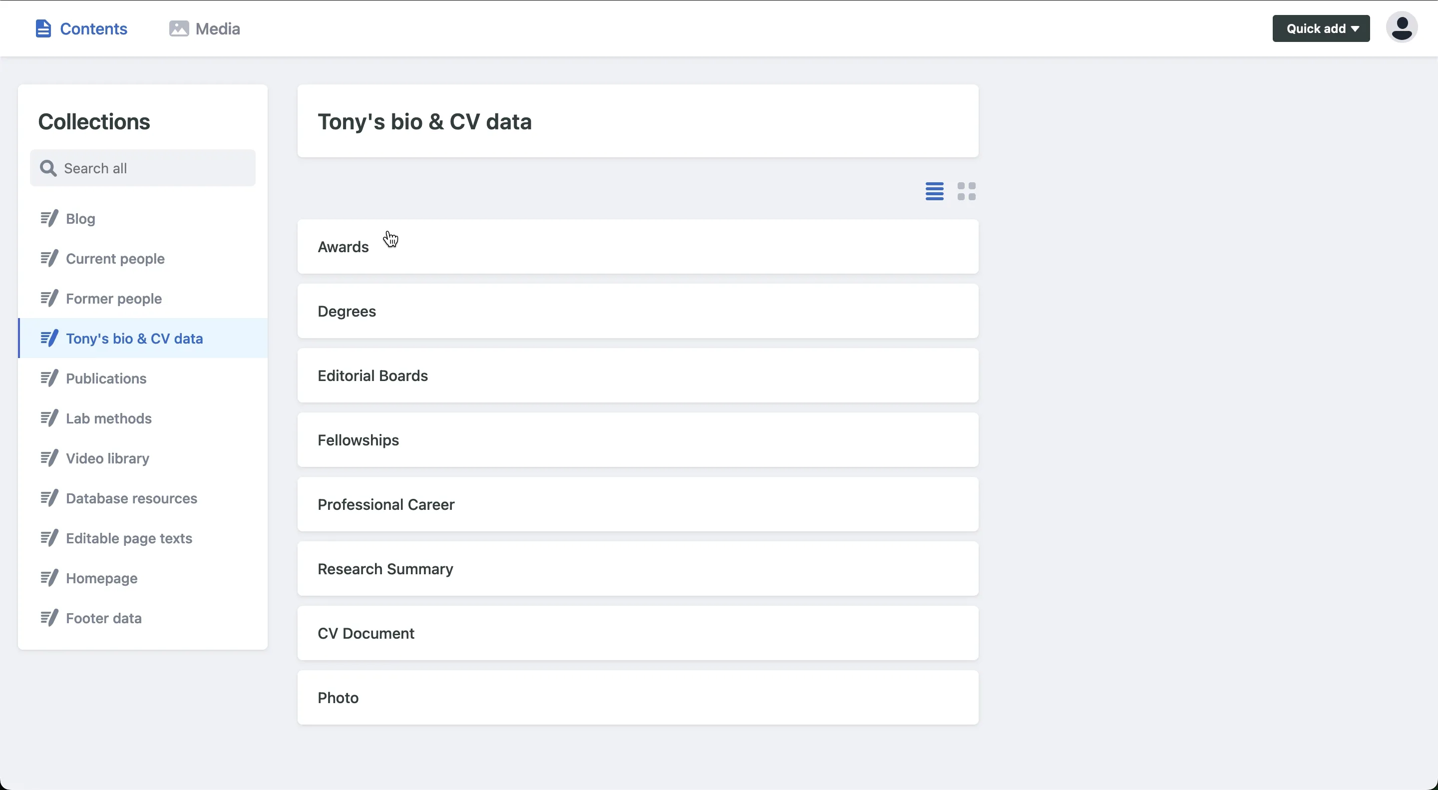
Screen 2: Resume content
Wordpress: The “Resume” section of the Wordpress sidebar can easily be overlooked or misread as the other “resume”, as in to continue doing something after pausing. The hover options do not include the word “award” anywhere, meaning this user path is semantically a dead end that is likely to send the user searching elsewhere even farther off-target.
Custom CMS: The word “Awards” is plainly presented as a named content category within the “Tony’s bio & CV data” header.
Screen 3: Awards overview
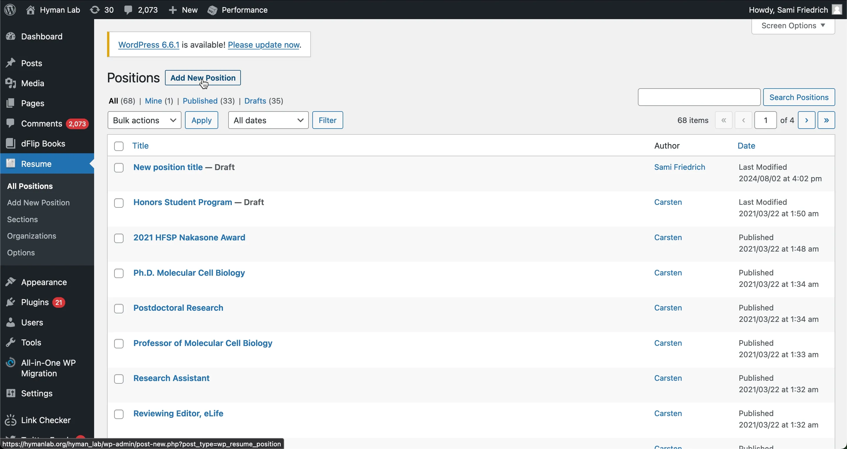
Wordpress: We’re now 3 screens into the user path and still no sign of the word “award”. Our test subject had to read through the list of “positions” to notice that awards were included here as well. It was only after scanning this ambiguously named list that he thought to try the “Add new position” button.
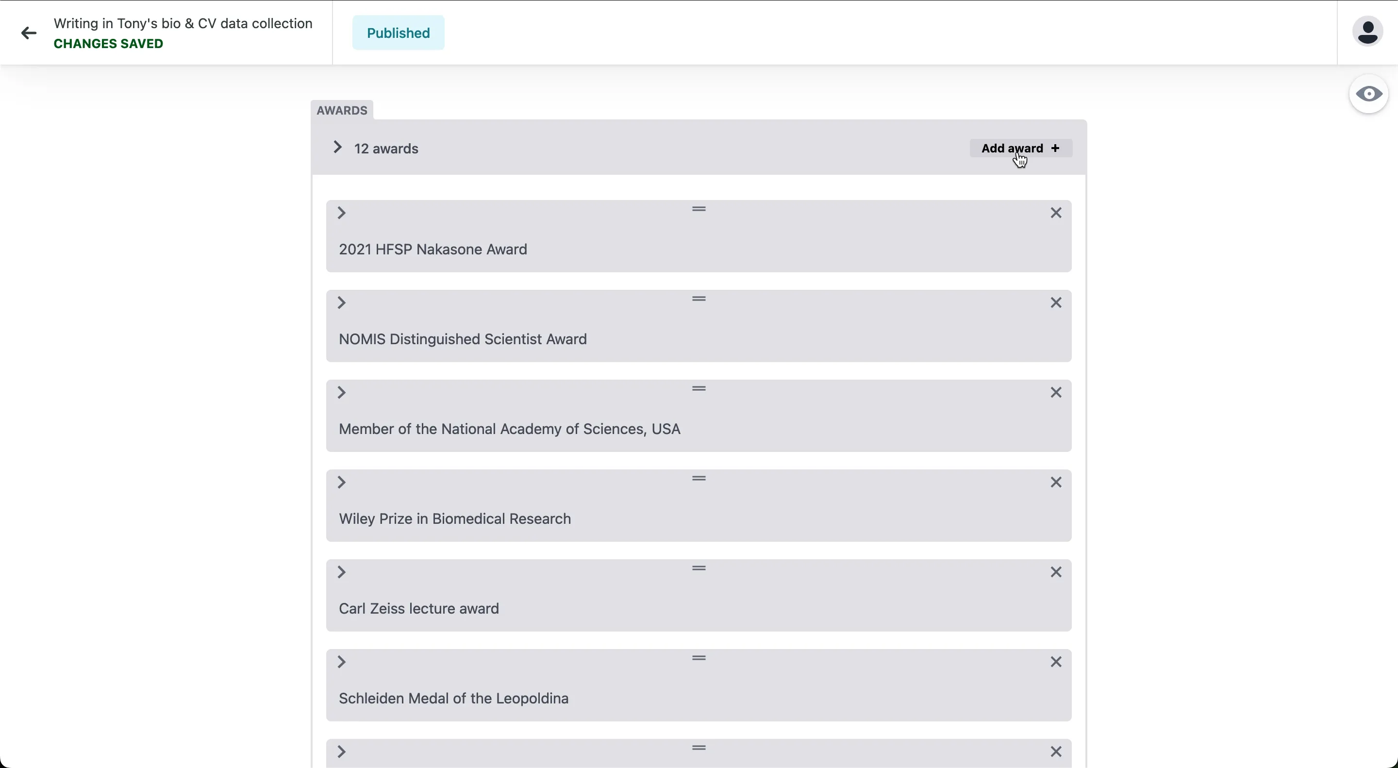
Custom CMS: The UI displays a clearly labeled list of awards and the “Add award” button is conspicuously located at the top of the panel.
Screen 4: Add award
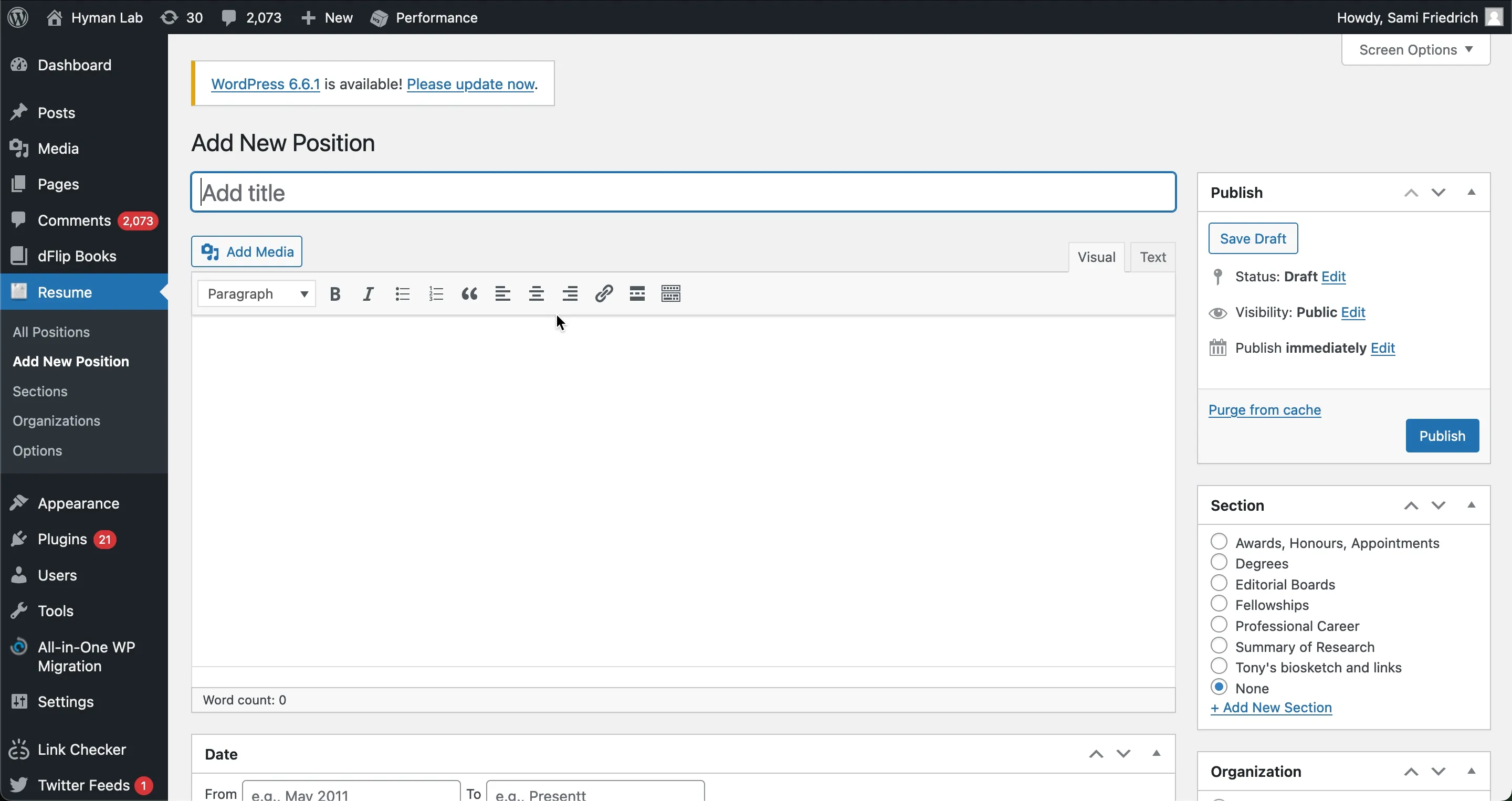
Wordpress: Again, the user interface confusingly suggests we’re adding a Position and not an Award. In order for the input data to be added as an award, the correct radio button must be selected from the “Section” panel on the right, a step easily overlooked and lacking an obvious safeguard.
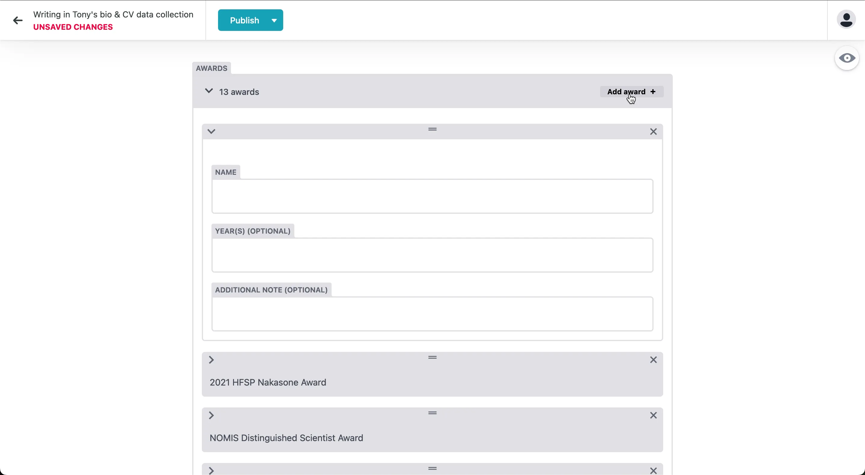
Custom CMS: The field labels ensure no ambiguity as to what type of CV data is being added with the word “award” appearing three times at the top of the user interface. There is no possibility of mistakenly adding a different or “None” type of CV data.
Conclusions
As we’ve now demonstrated with the help of our test subject Jon, the time (and headache) saving benefits of a custom CMS are largely attributable to the fully configurable user interface. By reducing clutter and using unambiguous labels, we can design user paths that are shorter, clearer, and more intuitive.
With Wordpress, there are constraints on what can be readily changed in how the dashboard is displayed. What’s more, navigating to editable content often requires prior knowledge of which data type or plugin to scan for in the dashboard, making it difficult to find things without the help of recent muscle memory or documentation.
With a custom CMS, every tab/button/link in the dashboard as well as every subsequent screen in the user interface can be customized to effectively communicate its destination and content type. This ability to modify user paths to be maximally intuitive to the people actually editing the content is one major way a custom CMS outshines its less flexible competitors.
Let’s not ignore the elephant in the room, though - setting up a custom CMS requires more work during the development stage of a website. However the extra time it takes to establish a custom CMS ends up being a mere fraction of the time saved downstream.
It’s also worth noting that the time savings aren’t the only benefit of a custom CMS. I’ve lost count of how many people have expressed that they’ve stopped updating their Wordpress site because they’re “afraid to break it” or “can’t remember how.” A frictionless user experience also means people are more likely to update and maintain their site, and that creates a better browsing experience for everyone.